
I don’t want to offend anybody. I know a lot of really good Century 21 agents and a bunch of good Century 21 brokers. But, come on! The ads over the past several years have been so bad that they are embarrassing! I mean look at the stupid thing that graces the back cover of the latest California REALTOR Magazine:
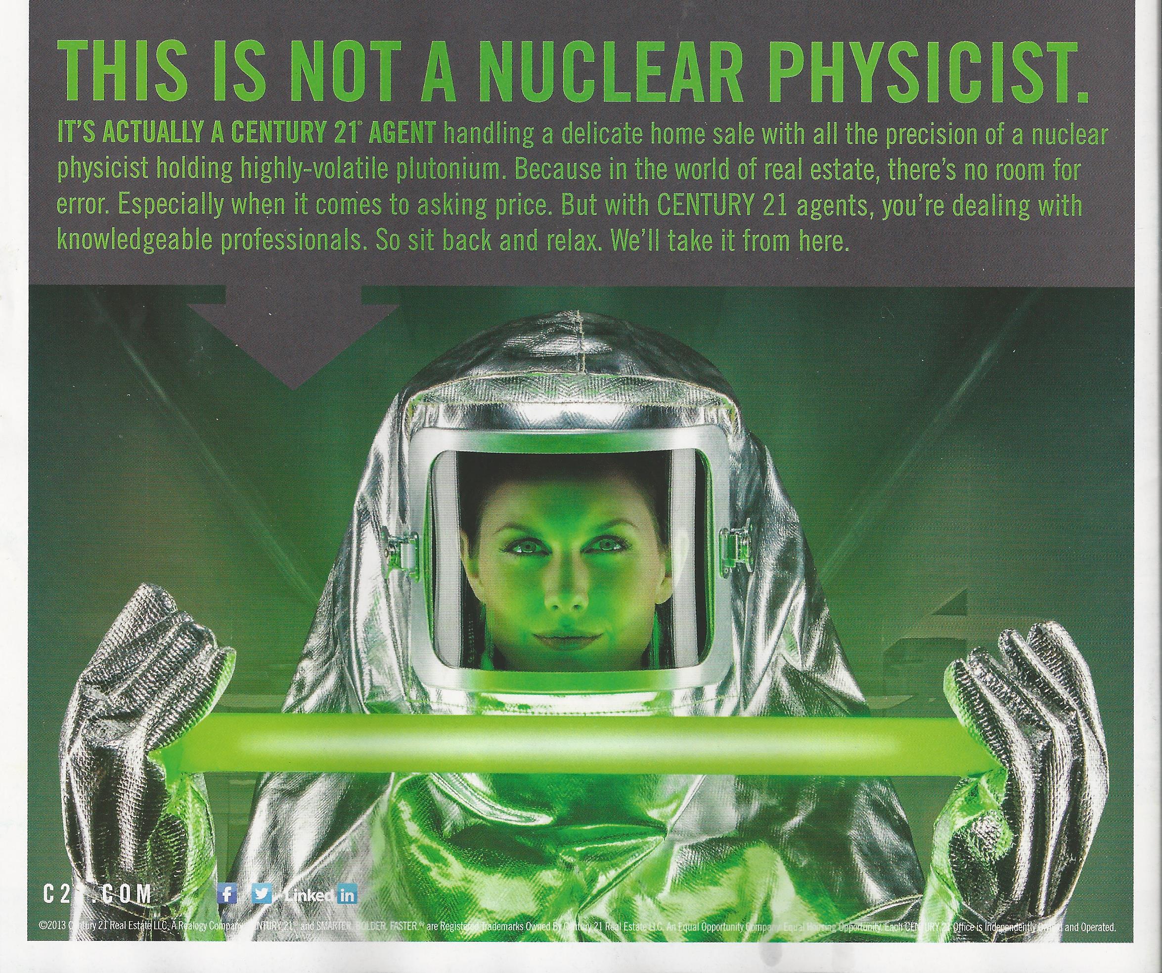
I guess this is an improvement over the ads in this series that ran over the past 3 or 4 years. They featured beautiful actors and actresses smiling – or more often smirking – confidently at the camera, pretending to be Century 21 agents while glowing adjectives flowed below. This ad makes no pretense at reality. It’s a cartoon. It’s a parody of the company’s own advertising.
If I were a Century 21 person (and I was for more than 20 years) I would be insulted, first by the color scheme. There’s not one drop of gold in the damn thing. Century 21 corporate declared war on gold sometime in the early ’90s (sad to say I was there and in on the discussions; I dissented). But no matter what they’ve done, no matter how hard they’ve tried to eradicate it, to distance themselves from that color, twenty years later THE PUBLIC still sees GOLD as Century 21’s color.
I watched an episode of ‘Breaking Bad’ last night – from the first season. They wanted a real estate agent on screen to be easily identified as such. What did they do? Put her in a gold coat. No question. Instantly anybody watching knew that was a real estate agent.
That kind of brand equity is priceless. And it’s very difficult to achieve. Century 21 owned the color gold and blew it up . . . and replaced it with . . . Green? No, Bilious Green?
But let’s take a wholistic view, too: let’s look beyond the bad color and the dumb message. Where is this ad placed? Back cover of REALTOR Magazine. That’s a $50,000 – $75,000 pop, depending on how big the contract is. The ad seems to be aimed at the buying and selling public . . . but it’s placed in a publication for REALTORS. So it’s suppposed to be a recruiting ad?? Or are we just becoming a little unfocused in our old age?
Again, the first ads in this series really were recruiting ads. The idea was by showing actors as bright, confident and beautiful Century 21 agents, failing agents at other companies would want to jump ship for a chance to be just like the ‘agents’ in the ad. (With logic like that is there any wonder per person productivity at Century 21 is said to have been in decline for decades?).
So back to the placement of this ad: I guess REALTORS seeing this ad are supposed to feel as if Century 21 agents have some kind of super-human advantage over them with buyers and sellers. Really? From this silly, embarrassing ad they are supposed to feel that? If I were a competitor in the field, I’d put this ad in my listing presentation to illustrate to potential sellers how stupidly some real estate companies spend their money!
Listen: I got a PhD in Branding and Marketing at Century 21 in the 80s and 90s. I learned from legends like Bruce Oseland, Elaine Hamilton, Dick McKenna, Rick O’Neil, Don Martin, Marty Rueter and many others. This was one of the things Century 21 did extremely well in the early days. They did it so well that, in the late 70s – early 80s, the effectiveness of their marketing was scary! They pretty much owned the concept of ‘Real Estate’ in the consumer’s consciousness.
The monkeying with with brand that started in the mid-nineties and continues to this day has undone that once very special organization. Today, Century 21 stands for generic real estate at its most mediocre. There is nothing special about the consumer offer (it’s just like everyone else’s), nothing special about the operating system (It’s an old -fashioned, percentage based, agent oriented model), and nothing special about the identity. If the function of marketing is to express the culture of the organization . . . well, I guess this ad has succeeded because today, Century 21 stands for nothing.
And it breaks my heart.
Hey, all of you marketing scholars out there! If you want a great case study on how to build a powerful brand and then systematically destroy it . . .well, here it is.
Footnote: There is a Help-U-Sell logo on this blog. It is a brand and operating system I happen to love. I do not, however work for Help-U-Sell. I did, but not now. Please don’t assume that I speak for that organization or anyone in it. This is my blog and my opinion; so if you are sharpening your arrows, aim them here. -JD