I’ve carped about it several times . . . most recently in my last post: Your website should enable potential sellers to learn how you can help them at a glance.
That seems so simple, until you start looking at real estate company websites. Most are oriented almost totally toward potential buyers – which is as it should be. Buyers find us online and if your company website doesn’t offer them superior tools and search capabilities they are not going to stop there. That’s why home search dominates almost every real estate company website.
But what if, like Help-U-Sell, your real estate company is really different? What if you have a completely different approach to working with home sellers than your competitors? If so, you’ve got a story to tell, and you’ve got to find a quick and easy way for potential sellers to hear it – which means ‘online.’
By the way, if you are Century 21, Coldwell Banker, ERA, BH&G, RE/Max, Exit, or any other national Brand, there’s no need to read further. You have nothing unique or special to offer sellers. It’s just business as usual done the same tired way it’s always been done in each of your offices. From a seller’s perspective, what’s the difference between Century 21 and Re/Max? Sign color.
Now, you, as an individual agent or broker, may be extraordinary! You may be completely unique in the spin you put on that old tired operating system. But consider this: if you were to sell your business to someone else, subtract your personality from the equation, what would your sellers have left? Yep: the same old tired way of doing business that is virtually identical to the way it’s being done in your competitors’ offices. No difference.
If, on the other hand, you ARE Help-U-Sell, you do have a completely different program for sellers. It costs WAY less, and the pricing makes sense! (what a concept)! You create opportunities for your sellers to save big time while delivering what they regard as ‘Full Service.’ You let them be as involved in the transaction as they want to be and you don’t play stupid REALTOR games like not letting them talk to potential buyers. If that’s you, you need to be using teaser ads to drive potential sellers to your website, where they can get a quick feel for what you do, which will enable them to take the next step: contact you.
In other words, you need a landing page for sellers, with its own unique URL and QR code.
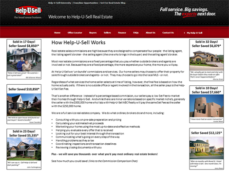
What should be on it? At Help-U-Sell we have a great template: the ETM. Pictures and descriptions of homes for sale, sold and saves, testimonials and an Easy Way. Here. I took a stab at creating a seller landing page. It’s not pretty, but it could be:

Ok: Sold and Saves, Testimonials, and a more detailed version of the Easy Way. By the way, I know you can’t read that, but if you’ll click it, it will open up a PDF version that you can view or download.
At the bottom there is a link to the great ‘You-We-They’ interactive savings calculator Robbie built last year. If there’s something missing it’s contact information or a contact form. Oh, and a request for a free CMA.
Once you have your landing page built, use Facebook Ads, Google Ads, little teaser ads everywhere to drive potential sellers to it. The landing page should communicate enough of your program so that a viewer would feel comfortable calling you. And you know what happens when they call you, right? About 97% of the time, you get the listing!
